

Claude Slides Tips: 16 Tricks for Noticeably Better Decks
You have already prompted your first Claude Slides deck, so this guide skips the Output menu and the first-run basics — those live in the beginner walkthrough. These 16 tips are what separate a generic AI deck from one that looks deliberate: how you phrase the brief, how brand and data get put to work, and how you fix slides without regenerating them. Every frame comes from Claude's own designer walkthrough, Brock Mesarich's launch breakdown, and Slides by Sander's hands-on test, so each trick is something you can watch work before you try it.
Source & credits
Screenshots in this guide are captured from Claude's public walkthrough video. Every step links back to the exact moment it shows, so you can follow along.
Claude ↗Shape the prompt, shape the deck
- 1
Talk the messy first draft, then drop the transcript in
Claude's designer walkthrough starts away from the desk: Nate records a rambling voice memo on his phone — "it's usually chaos, but that's okay" — then drags the transcript file straight into Claude. A spoken brain dump sidesteps the blank-slide problem and gives Slides raw material in your own words, which is exactly what the next step asks for.
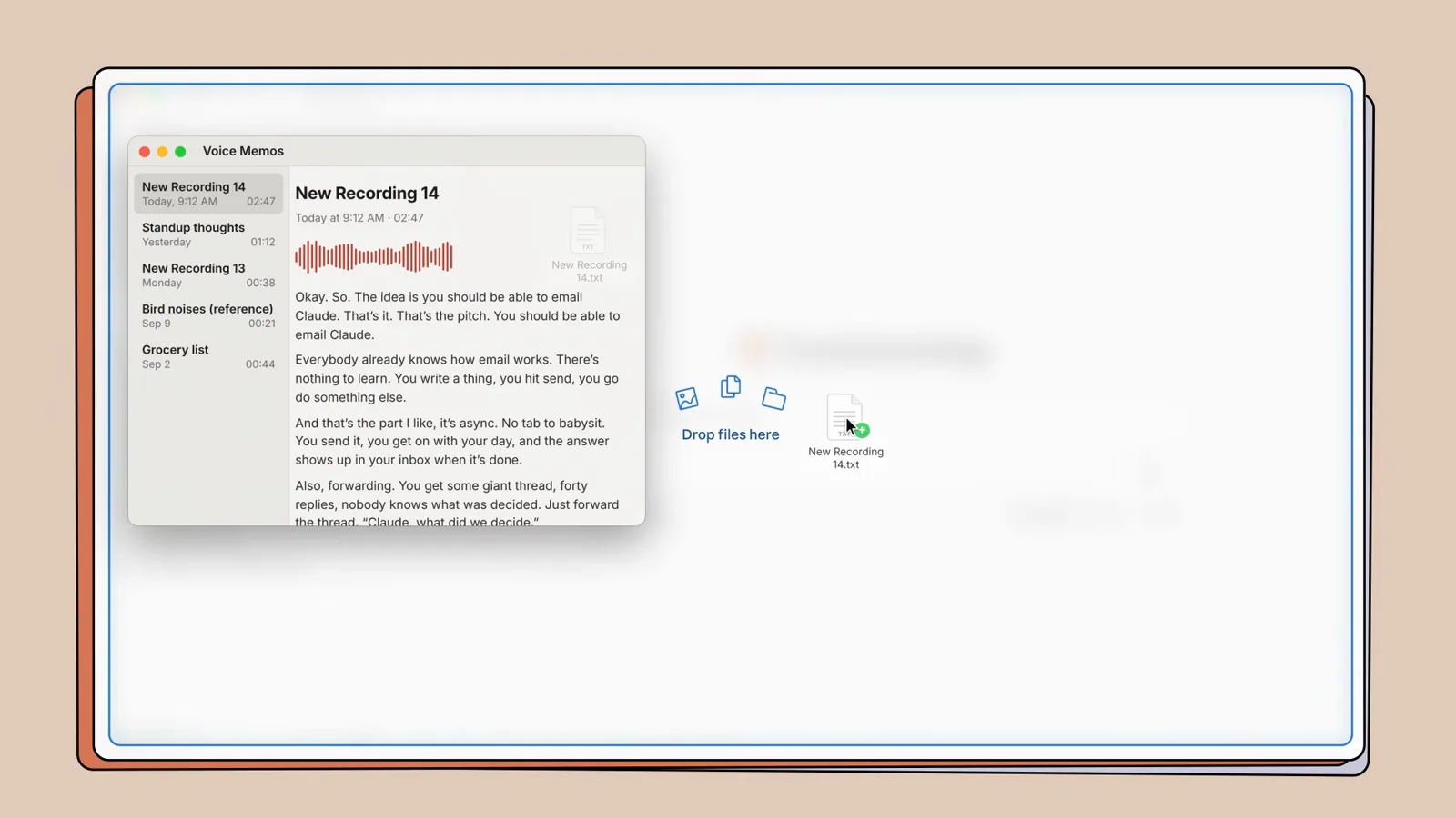
The raw material for a deck can be a rambling voice note.Watch at 0:56 - 2
Add one instruction: keep my words, just organize them
The demo's brief is a masterclass in restraint: the transcript attached as a .txt, then "turn my exact words into a presentation using claude slides, but organize them in a way that makes sense. I don't want it to invent new words. Just my words." The Slides chip under the composer routes the task, and the design-system option sits right beside it. Telling the model what not to do is half the prompt.
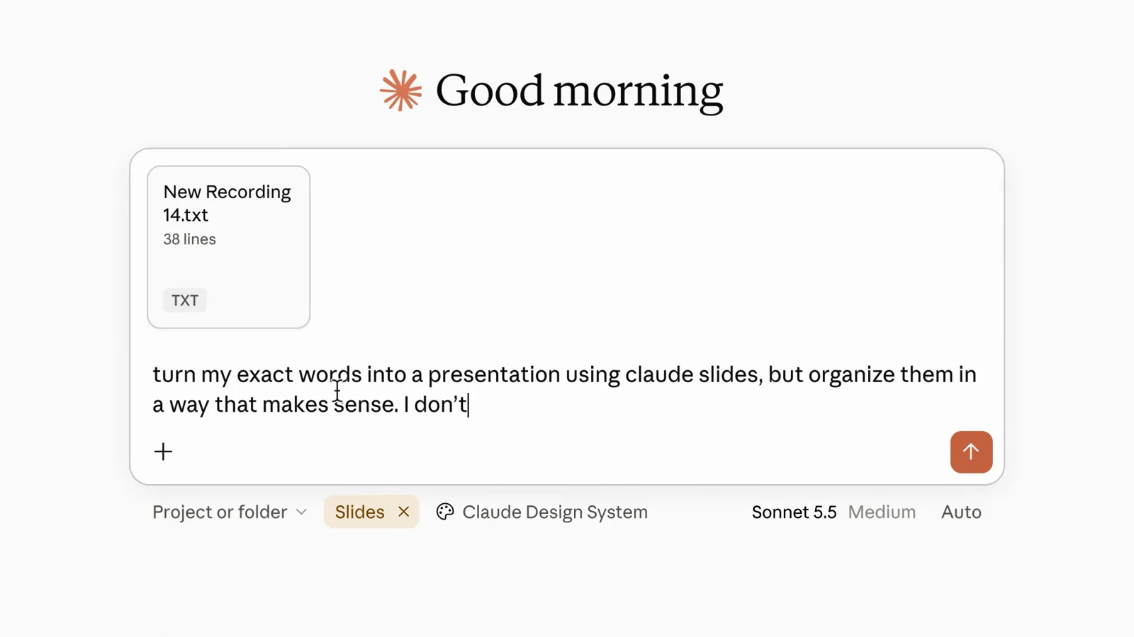
The Slides chip routes the job before you hit send.Watch at 1:00 - 3
Let Claude propose the structure before it builds
Rather than dumping slides, the reply reads: "I'll read the transcript first, then lay your own sentences out as slides without adding anything" — it groups related thoughts, picks the sentence that names each idea as its headline, and keeps the order you said them in. Treat that reply as a free checkpoint: course-correct in chat before a single slide is generated, while changes cost seconds instead of a regeneration.
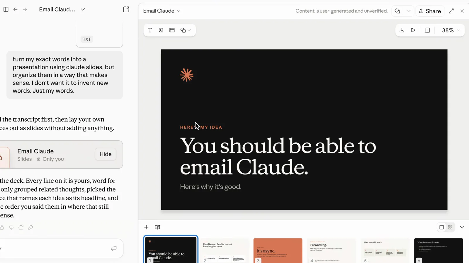
Approve the outline in chat before any slide exists.Watch at 1:04 - 4
Name the audience, the count and the file format
Sander's whole brief fits in three lines: "Create a presentation about my landscaping business. I need 7 slides to present my company to potential investors. The file should be a pptx file." Audience (investors), job (present the company), slide count (7) and destination (.pptx) — no adjectives required. In this recording he ran it on a free-plan account and still got a usable seven-slide investor deck back in a few minutes.
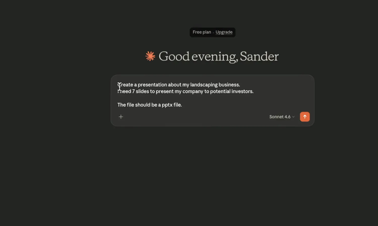
Three lines, four constraints — that is a complete brief.Watch at 1:32
Make it on-brand without babysitting it
- 5
Attach the data file and pick the design system first
Brock attaches demo_clients.csv, flips the task to Slides, then opens the design-system picker — Bramble under Yours, plus Manage design systems and New design system — before typing a single word. Choosing the system up front means the deck inherits your fonts, palette and components instead of defaults, and the prompt box can stay about content: "What should this deck be about?"
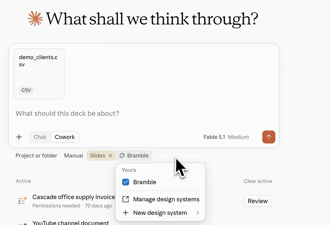
Design system first, words second — the deck inherits both.Watch at 3:42 - 6
Brand type shows up on the slide, not in a settings hunt
On the finished title slide, selecting "Here's why it's good." raises a floating toolbar reading Anthropic Sans · 44 with color, weight, link and list controls inline. The designer's own framing: "He knows our corporate identity, so I don't have to look for new fonts or slide templates." Once the system is set, per-slide tweaks are one click on the canvas rather than a theme-editor safari.
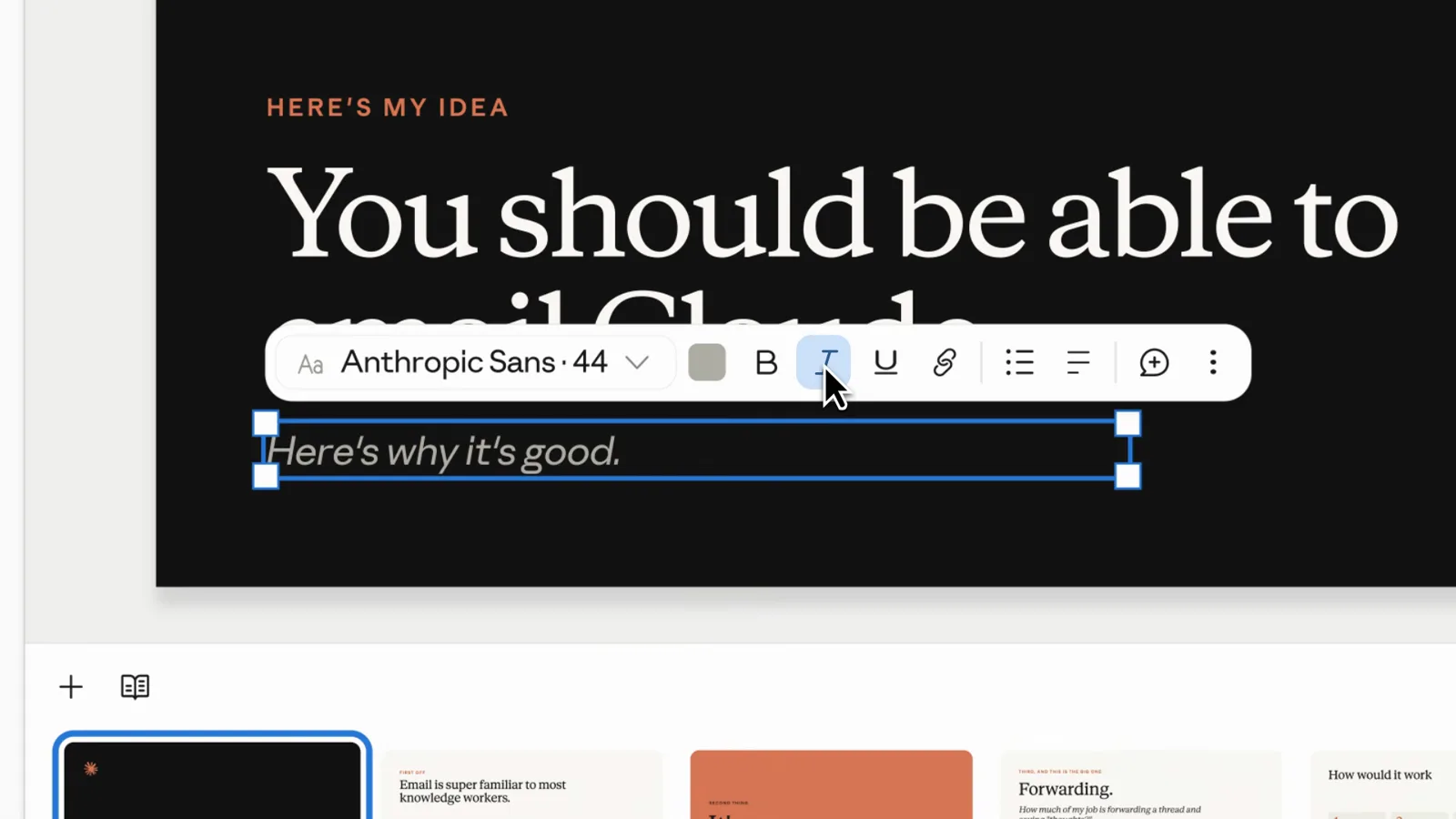
Select text, get the brand font — no theme digging.Watch at 1:08 - 7
Ask for one idea per slide and let cards carry the rest
The brief said "organize them in a way that makes sense" — the result is this slide: one full-width claim, "Email is super familiar to most knowledge workers.", over exactly three support cards. No bullet walls, no paragraphs. When you brief a deck, say you want very little text and a single idea per slide, then tighten any heading to one sentence directly on the canvas, as the Heading 2 selection here shows.
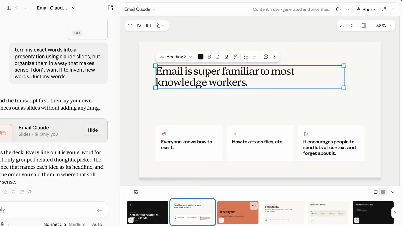
One claim, three cards — density you can present from.Watch at 1:11 - 8
Restyle by hand when one slide needs it
The editor is a real canvas: a rail on the left holds the deck's color swatches, the top bar carries font and alignment tools, Present and Share sit top-right, and "+ New slide" waits under the thumbnails. In the walkthrough the demo deck is being nudged by hand — text selected, colors swapped — the "one or two small edits" its maker says he does himself. Hand-fix the last 10% instead of re-prompting the 90% that already works.
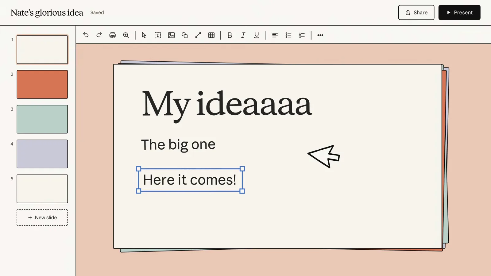
Swatches, type tools, a canvas — small fixes stay small.Watch at 0:16
Let the data slide do the persuading
- 9
Feed raw data and ask for the visualization, not the deck
Brock's prompt: "turn this CSV file of these demo clients into a slideshow that could visualize all of this data and information for me." The reply reports "Your deck is ready: 12 slides in your Bramble design system, built straight from the CSV," and the cover states the job — "50 demo clients, at a glance." Hand over the messy spreadsheet, describe the takeaway you want surfaced, and let the structure follow the data.
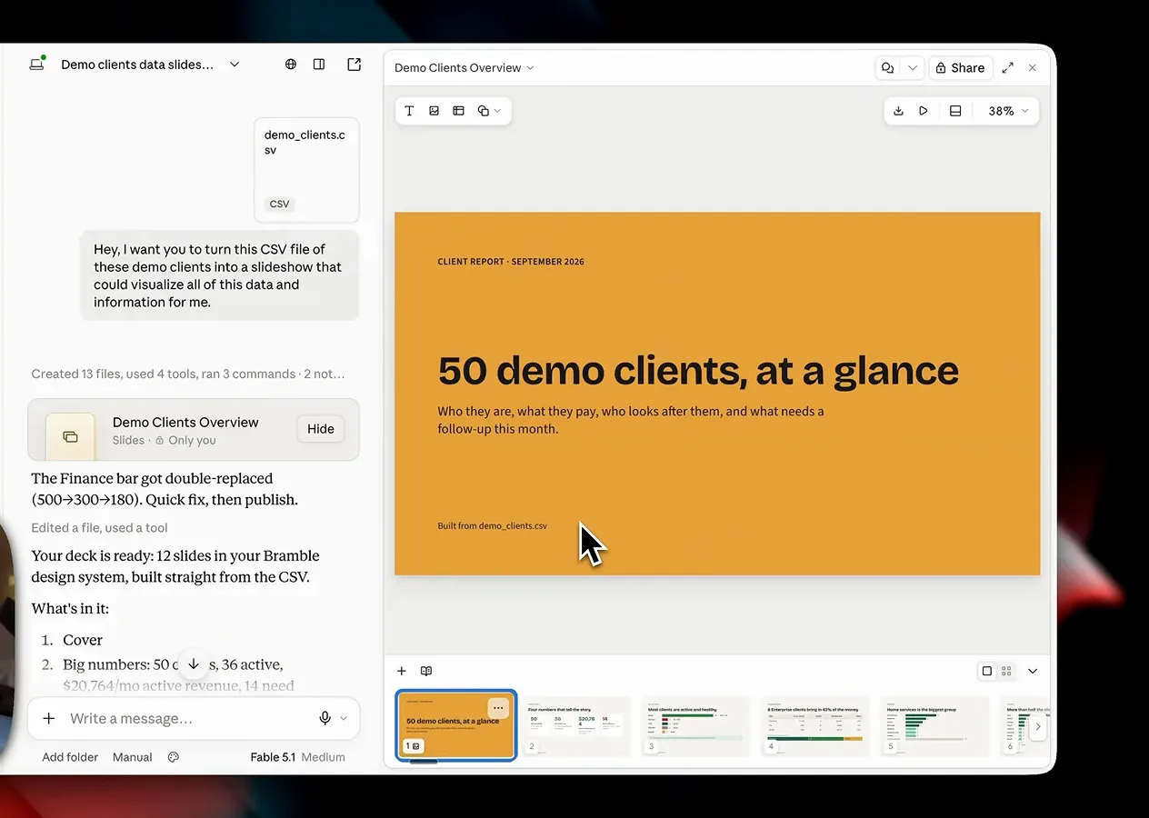
CSV in, message-title deck out — twelve slides, on brand.Watch at 4:00 - 10
Expect status charts with the insight already written
From that same CSV the deck draws account status as a bar chart — Active 36 · $20,764, then past-due, trial, churned and paused — and adds its own callout: "Past-due accounts are worth $1,096 a month. Fixing 4 billing problems recovers 5% of revenue." That is the trick: ask for a visualization and Claude pairs each chart with the so-what sentence. Verify the numbers against your source before anyone senior does.
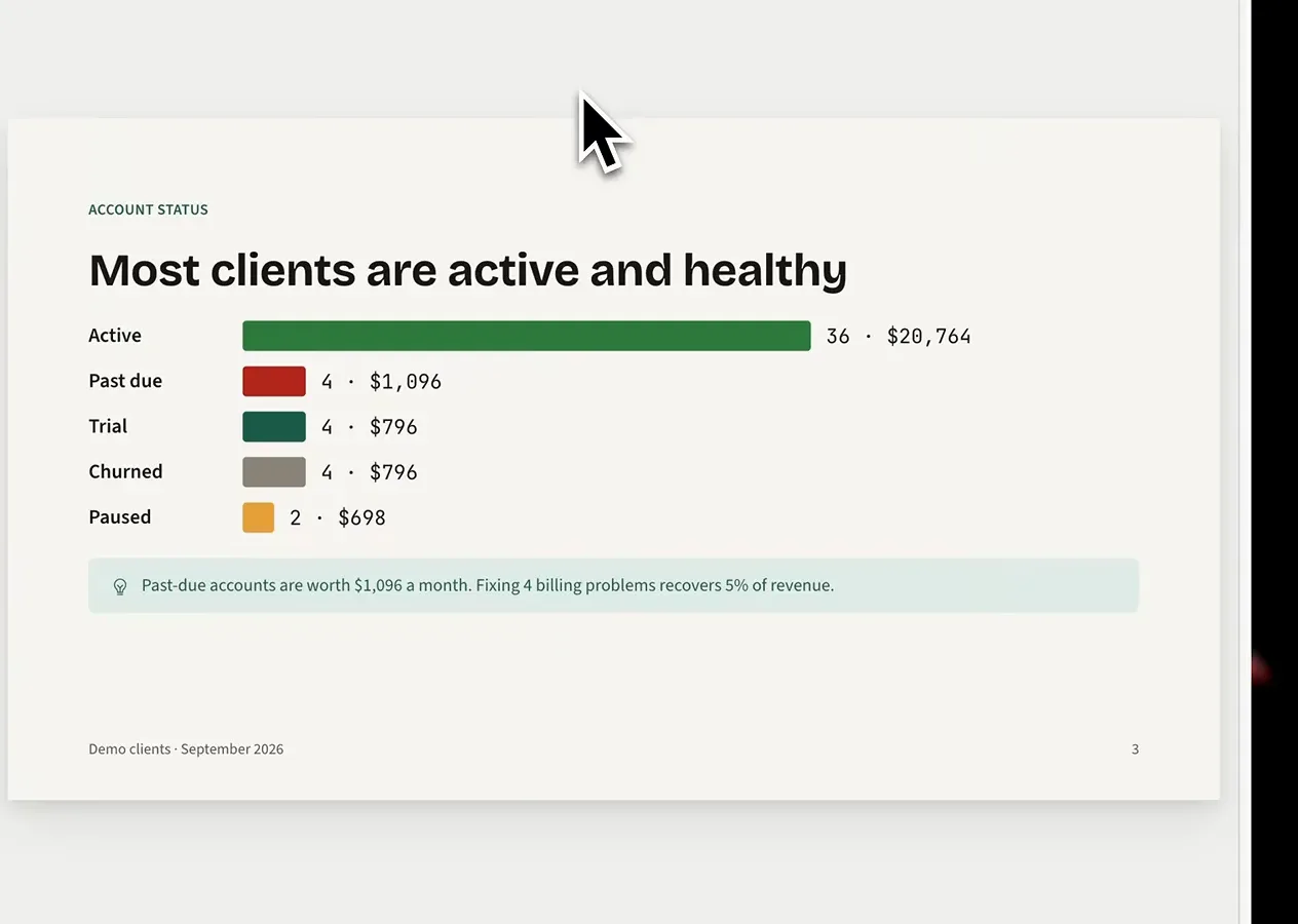
Chart plus takeaway — the slide writes its own so-what.Watch at 4:12 - 11
Let comparisons become cards, not spreadsheet dumps
Per-manager performance lands as "Three managers, an even split": one card per person with client count, monthly revenue and a note like "Holds 3 Enterprise accounts, including Kim Creative, the top earner." When your data has an entity — people, products, regions — ask for one card per item, side by side, instead of a table. Where row-level detail genuinely matters, Claude keeps a real table; that is another slide in the same deck.
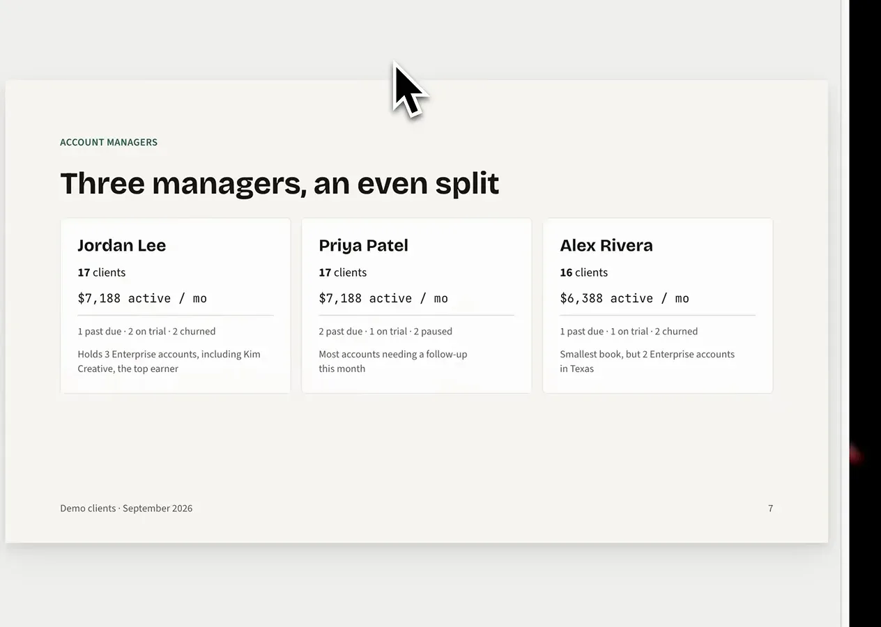
People-sized facts belong on people-sized cards.Watch at 4:18
Fix, comment, share — no rebuild required
- 12
Rewrite headlines yourself — the title is the message
Notice this deck's titles: "Most clients are active and healthy", "The 8 Enterprise accounts, $1,299 a month each" — claims, not topics. Ask for takeaway titles in the brief, then fix stragglers by hand: select the headline and the Bricolage Grotesque · 72 toolbar appears for instant rewording and restyling. A sharper title is a five-second edit; sending the whole deck back for regeneration is not.
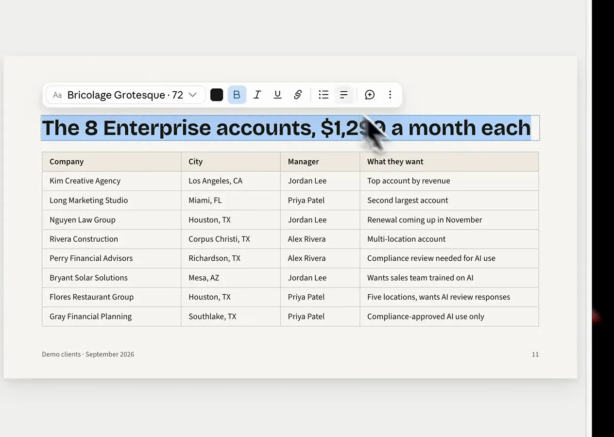
Message titles sell the slide — retype them inline.Watch at 4:36 - 13
Leave an @Claude comment when the fix is structural
On the orange "It's async." slide, the reviewer quotes a line — "No tab to babysit." — and comments "@Claude: This is the best line in the whole memo. Make it its own slide.", with Send to Claude checked. The comment anchors to the exact spot, and the ask is structural: promote, split, cut. Rule of thumb — hand-edit words, comment when content needs to move between slides, and re-prompt only as a last resort.
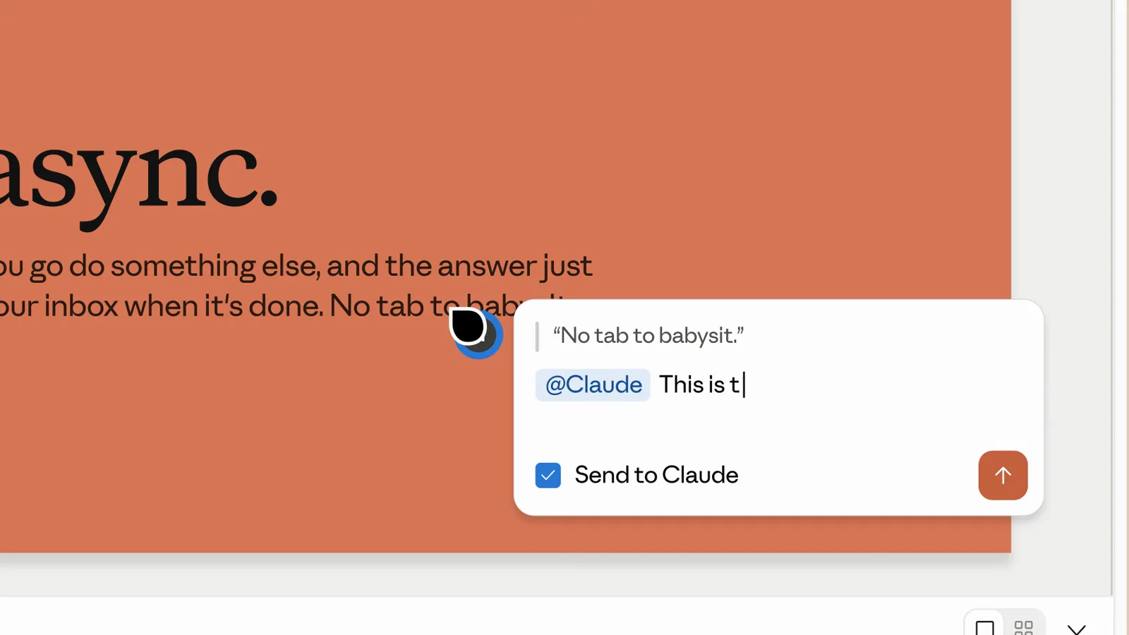
Comment where it hurts; Claude restructures that spot.Watch at 1:16 - 14
Set access before you send the link
The Share dialog's "Who has access" menu is the whole tip: Only you, Only people invited, Anyone at Today's Thing, or Anyone with the link — "People with the link can view, but not edit." Deck links are live documents, so choose deliberately: invite teammates by email to collaborate, keep client drafts locked down, and reserve open links for finished leave-behinds you would print.
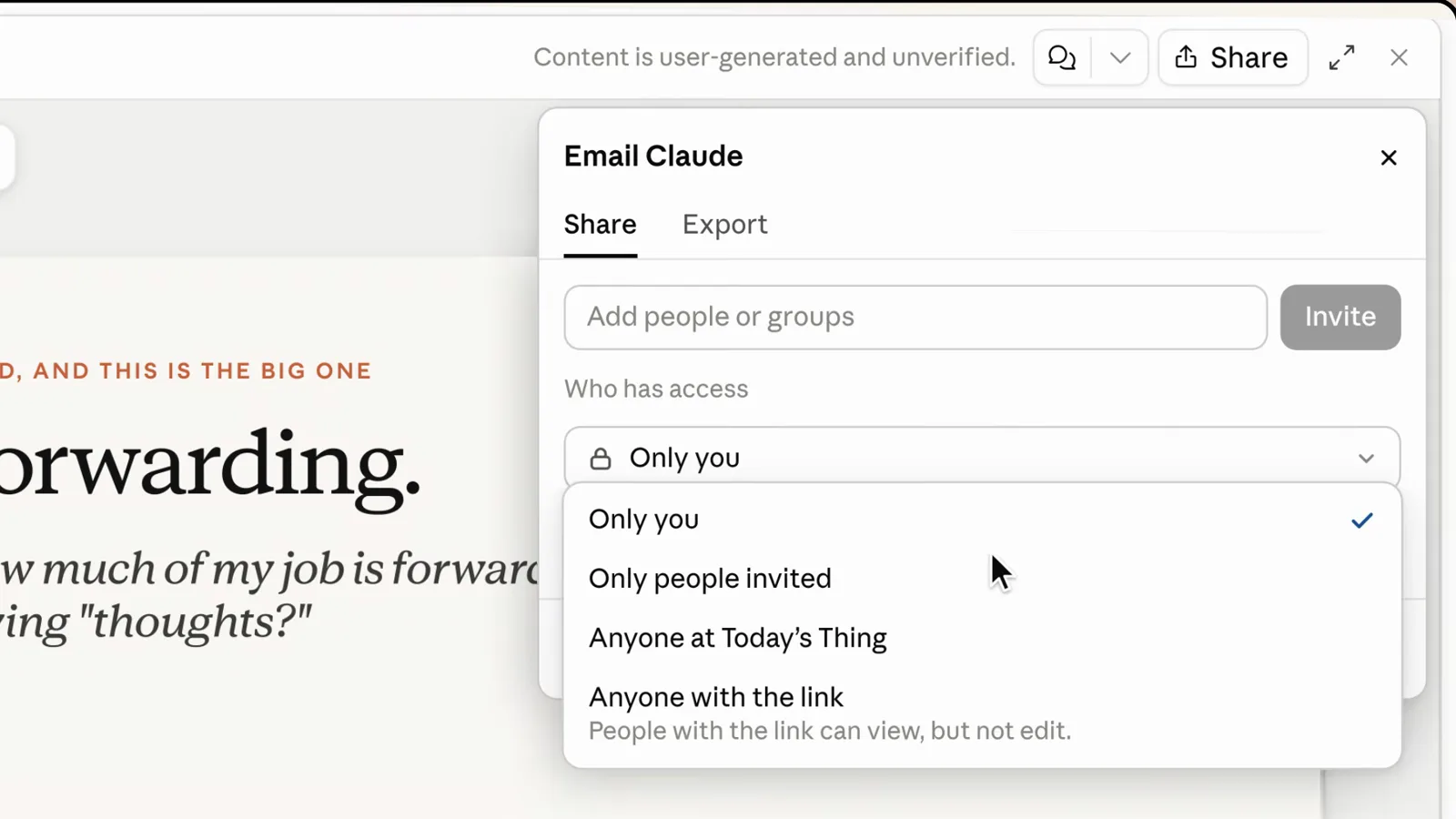
Four access levels — pick before the link leaves the building.Watch at 1:27
Take it out at the right quality
- 15
Pick the export by destination, not by habit
The Export menu reads like a launch checklist: HTML as a standalone web page, PDF for printing and sharing, PowerPoint as an editable .pptx presentation — then Send to Canva, Gamma or Miro for when the deck continues its life in another tool. Match format to what happens next: .pptx when someone will edit, PDF when they will only read, and the live share link when they just need to look.
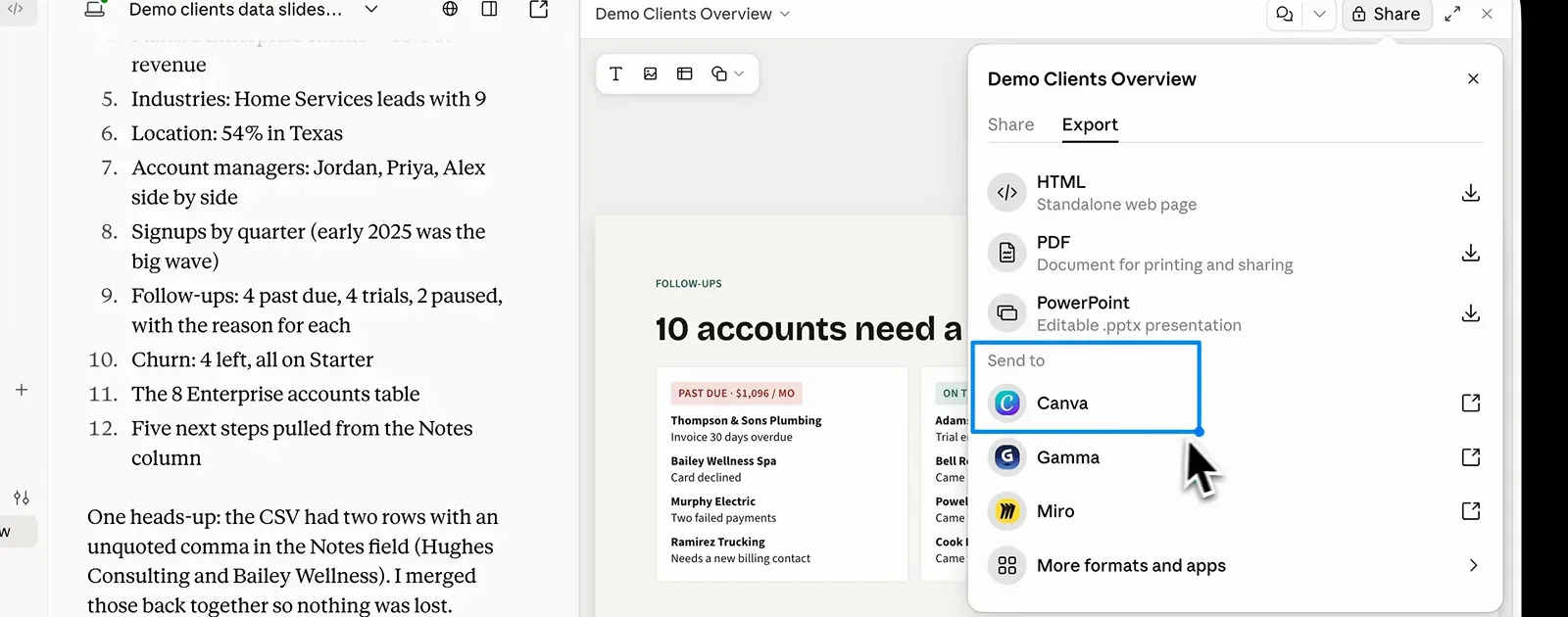
Match the format to the room the deck is going into.Watch at 5:20 - 16
Know what survives the .pptx: charts do, theming doesn't
Sander's post-export teardown found the KPI cards and the Revenue Growth chart alive and well in PowerPoint — the chart keeps editable data, so the nudge on screen (that is a position tooltip) behaves like any native chart. The catch: fonts and colors arrive as loose formatting rather than theme tokens, so a company-wide restyle means touching slides by hand. For decks destined for Office, brief conservative styling up front.
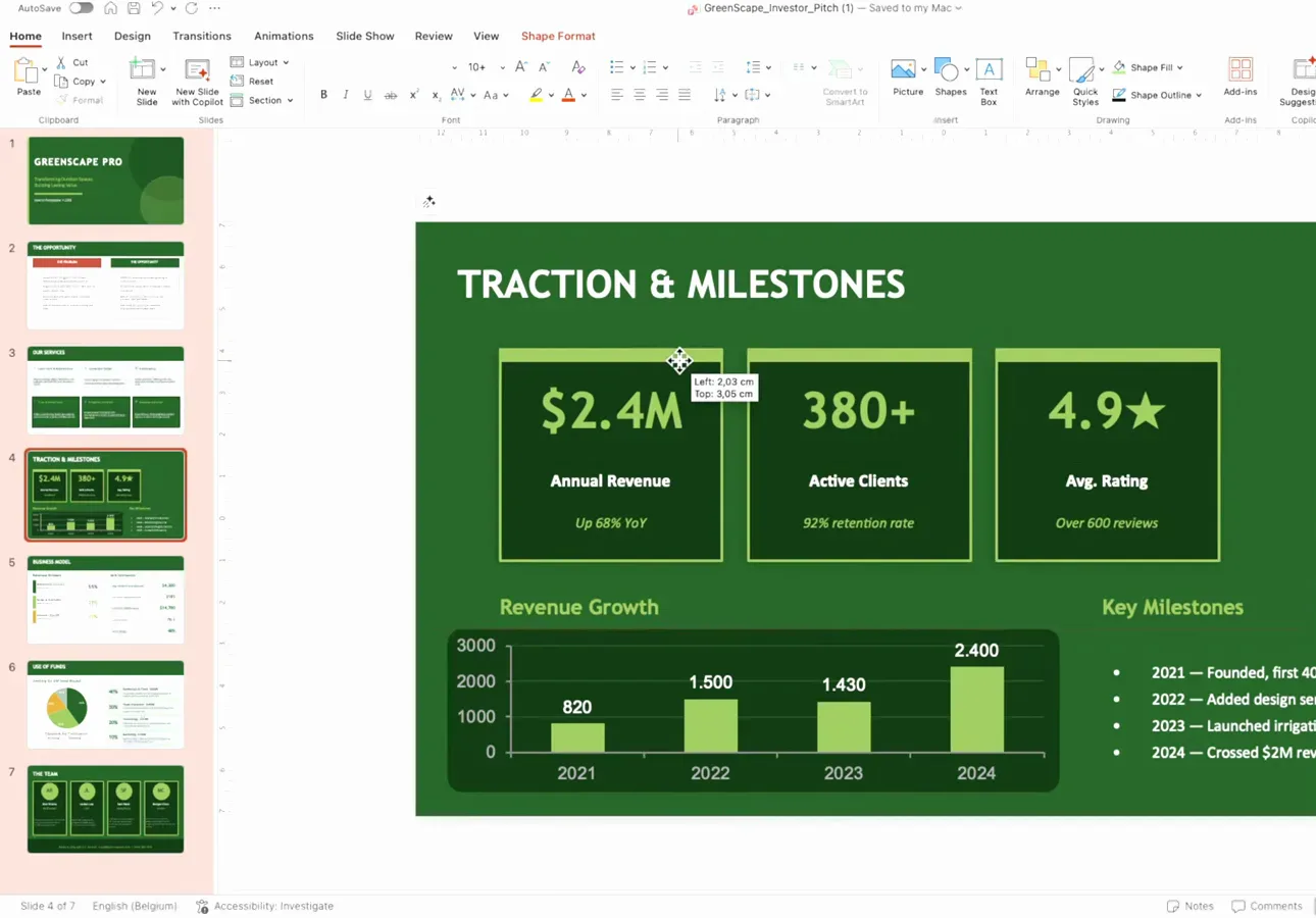
Charts cross the border alive; the theme does not.Watch at 10:26