

Claude Slides Templates: 3 Reusable Deck Structures
Every screenshot is from Kenji Explains' Claude Design walkthrough. Paul J Lipsky's tutorial supplies the brand-system and export flows; Jay E RoboNuggets maps the Claude Code route. Slides-vs-Design boundary in the FAQ.
Source & credits
Screenshots in this guide are captured from Paul J Lipsky's public walkthrough video. Every step links back to the exact moment it shows, so you can follow along.
Paul J Lipsky ↗Template 1: the consulting-style Q2 review
- 1
Page one leads with the verdict, then five KPI cards
Kenji drops a Q1-Q2 sales workbook into Claude Design and asks for a consulting-style review: an executive summary, revenue performance, target versus actuals, five slides. Page one opens with the headline "Q2 closed within 0.3% of plan", five KPI cards ($5.94M revenue at 99.7% of target, $15.9M pipeline, 30.3% conversion, 1.68% churn) and paired What-went-well / What-needs-attention columns. Copy this skeleton as the fixed opening page of any review deck.
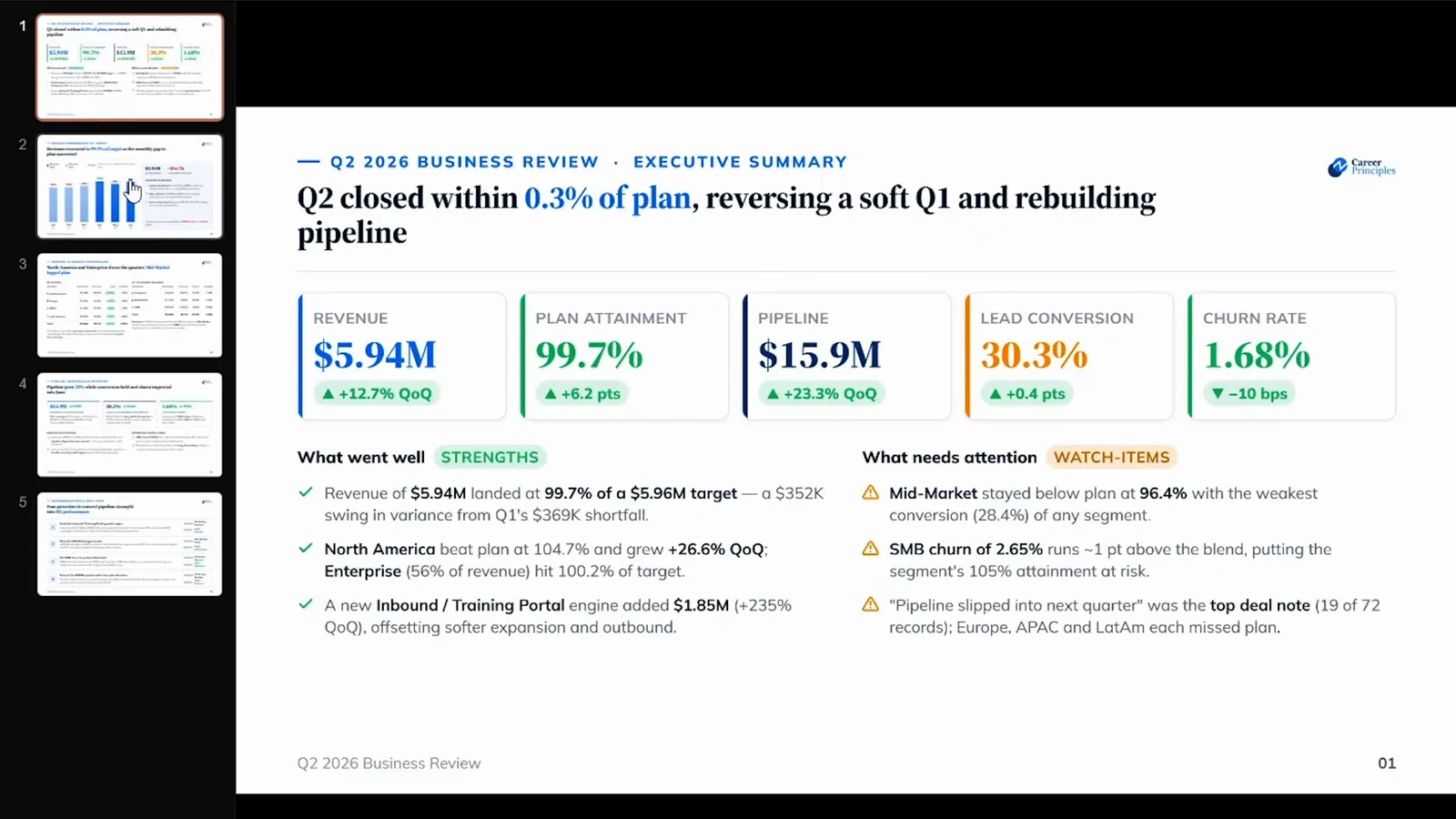
The verdict is the title; the numbers sit in cards. Ten seconds and the first page has landed.Watch at 3:29 - 2
Page two is the variance chart - and every figure traces back
Slide two plots actual monthly revenue against target from January to June, with the recovery to 97.2% of target and the residual $16.7K gap called out beside the chart. Kenji then spot-checks one figure in the source sheet: the 5.94M Q2 revenue is exactly the sum of the raw rows. Templates transfer; the number-checking habit has to come with them.
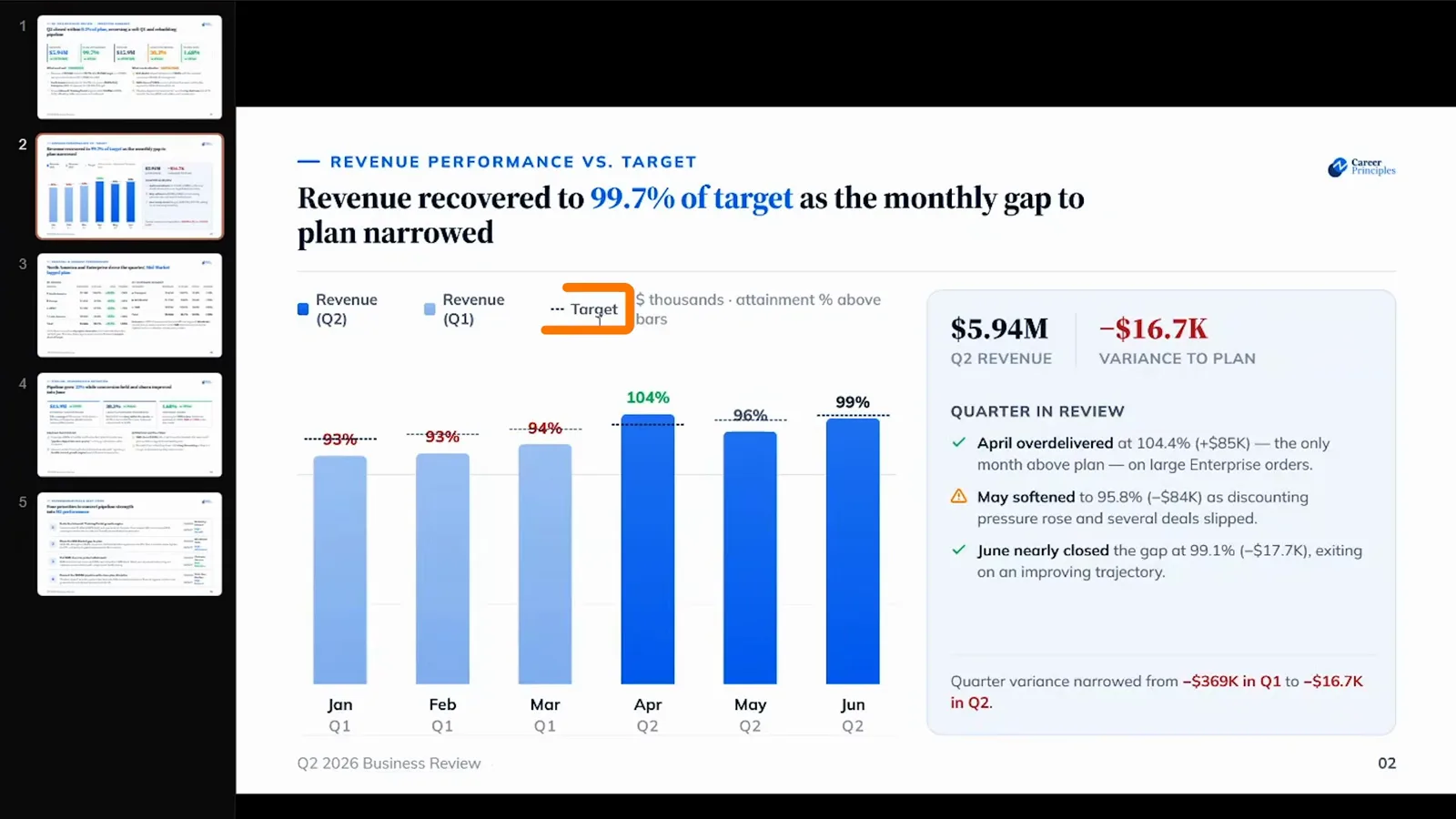
Bars carry the trend, the side note carries the gap. Verify against the source before the meeting.Watch at 3:33 - 3
Page four: pipeline, conversion and churn each get a card
The forward-looking page splits into three cards - $15.9M pipeline (up 23.3%, 2.7x coverage), 30.3% lead-to-customer conversion (up 0.4 points) and 1.68% churn (down 10 basis points) - over two commentary columns labelled Reading the pipeline and Retention watch-items. Three cards, two columns: that is the fixed skeleton for any growth review.
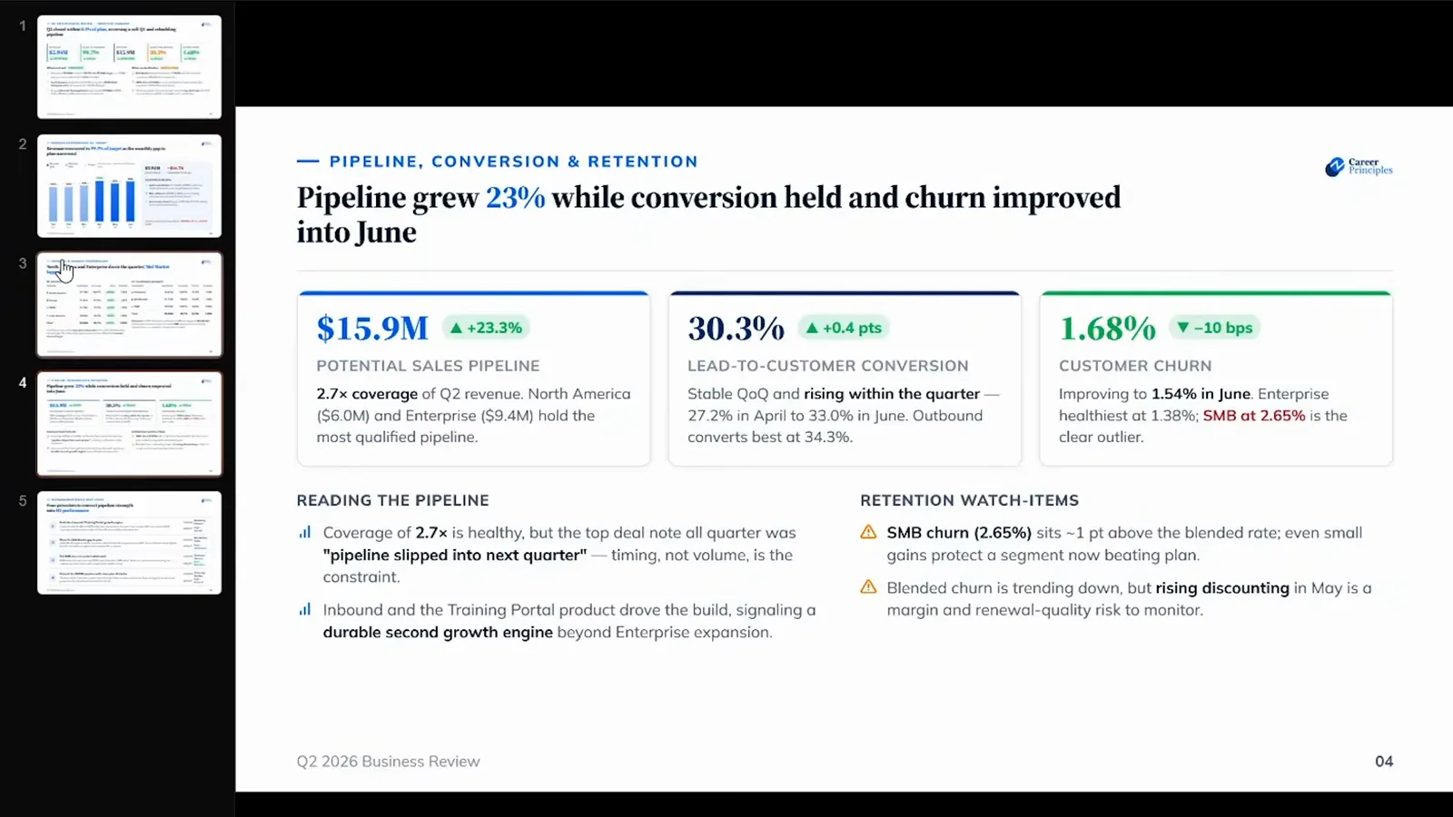
Forward-looking metrics get their own page, kept apart from last quarter's revenue.Watch at 3:38 - 4
The closing page: numbered recommendations, each with an owner
The deck ends with four numbered recommendations - lean on the Training Portal growth engine, close the Mid-Market gap, cut S&M hires to protect attachment, convert the $15.9M pipeline - each with a one-line rationale and an owner tag (Marketing Hire, Mid-Market, Customer Success, Sales Dev Reps). A review without owned next steps is a report, not a review.
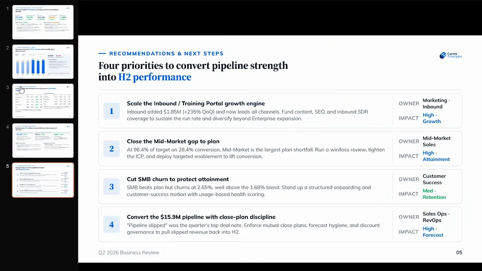
Number the actions, give each a one-line why, put a name on it.Watch at 3:40
Template 2: the interactive go/no-go deck
- 5
First screen: three scenarios compared in one table
The second structure runs on Claude Design's Prototype tab. Kenji prompts for an interactive presentation evaluating a new store, and the first screen lays out downside, base and upside cases for monthly profit, break-even month, payback and year-one P&L - with a black recommendation card concluding: open only with a funded launch plan targeting near-upside footfall; 9 months to payback.
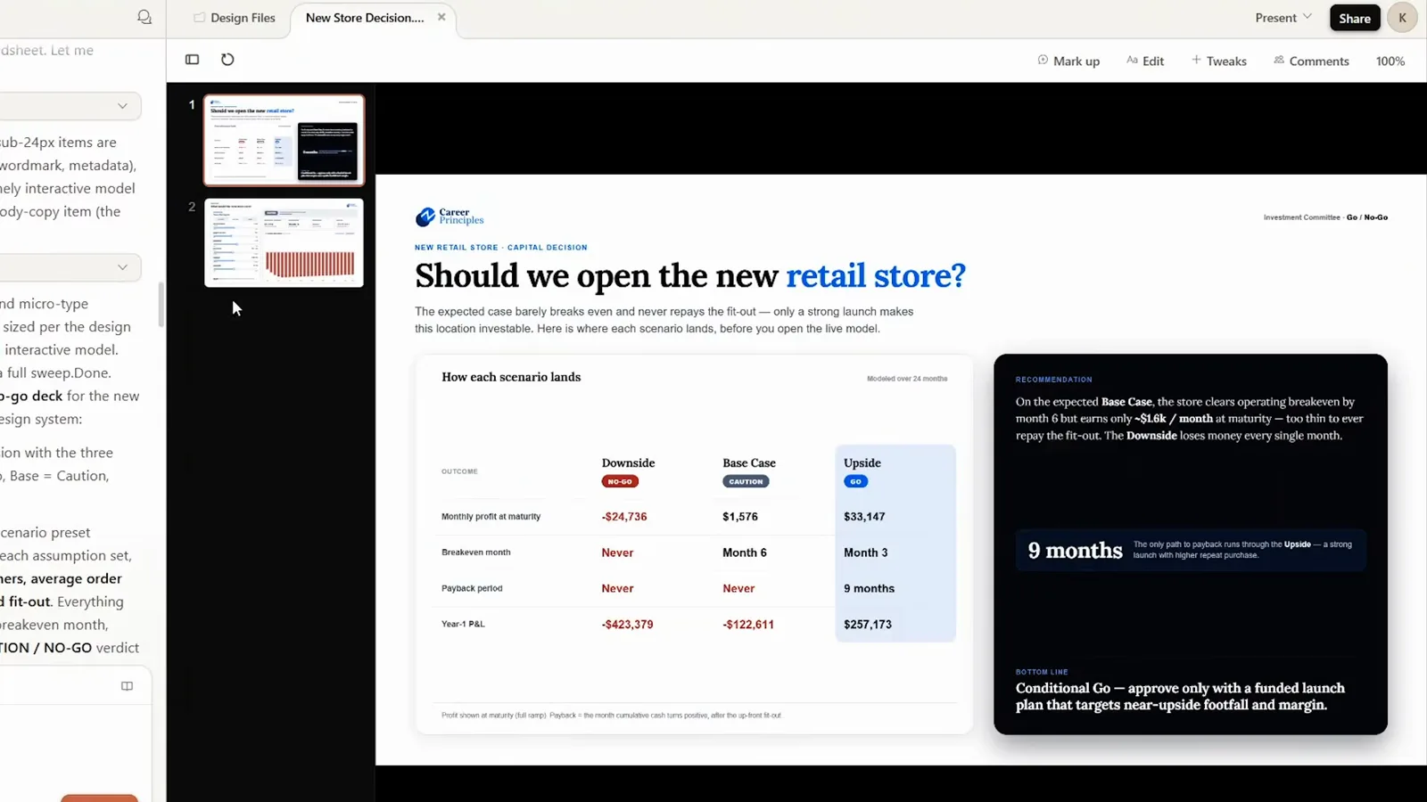
Three sets of assumptions, one table, and the recommendation card says 9 months.Watch at 7:10 - 6
The dials page: default assumptions light up CAUTION
The "What would the new store earn?" page carries input dials for monthly customers at maturity, average order value, gross margin, monthly rent, staff costs and the initial fit-out. At the defaults the badge reads CAUTION: $1,578 of profit at month 8 and a cash position that never recovers inside the horizon, bottoming at -$122,811. Leading with the worst case is what earns the page its credibility.
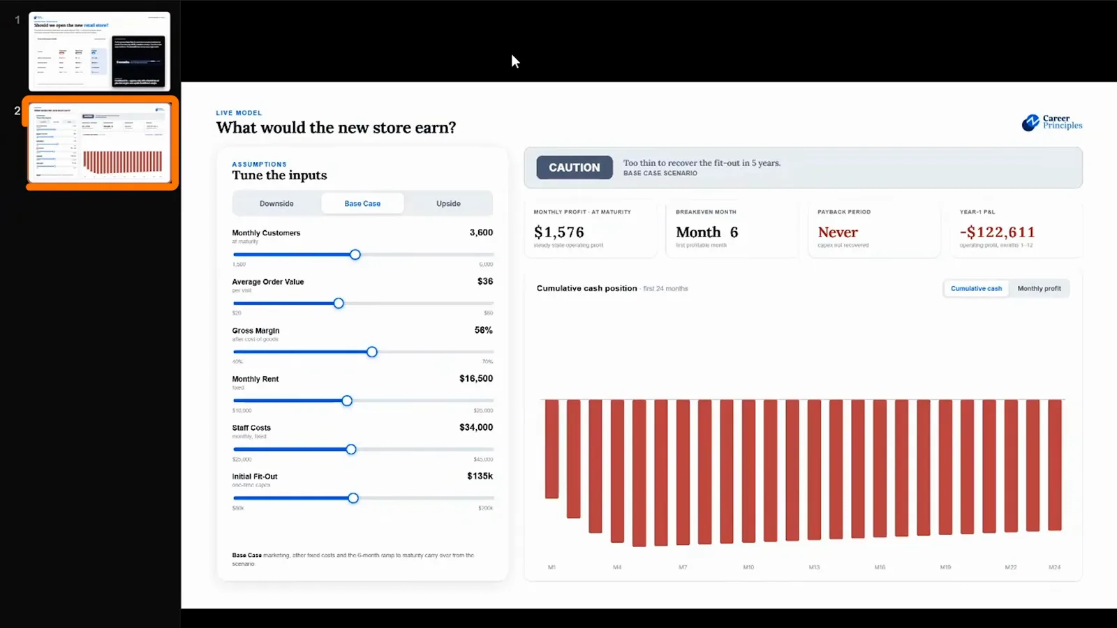
Dials untouched, the truth first: the default case does not support this store.Watch at 7:16 - 7
Drag a dial and watch the break-even month appear
Push monthly customers upward and the red cash-burn bars shrink month by month until the break-even marker lands at month 3 and the badge flips to GO. This is the slide that does what a static deck cannot: the audience watches the verdict change as the assumption moves.
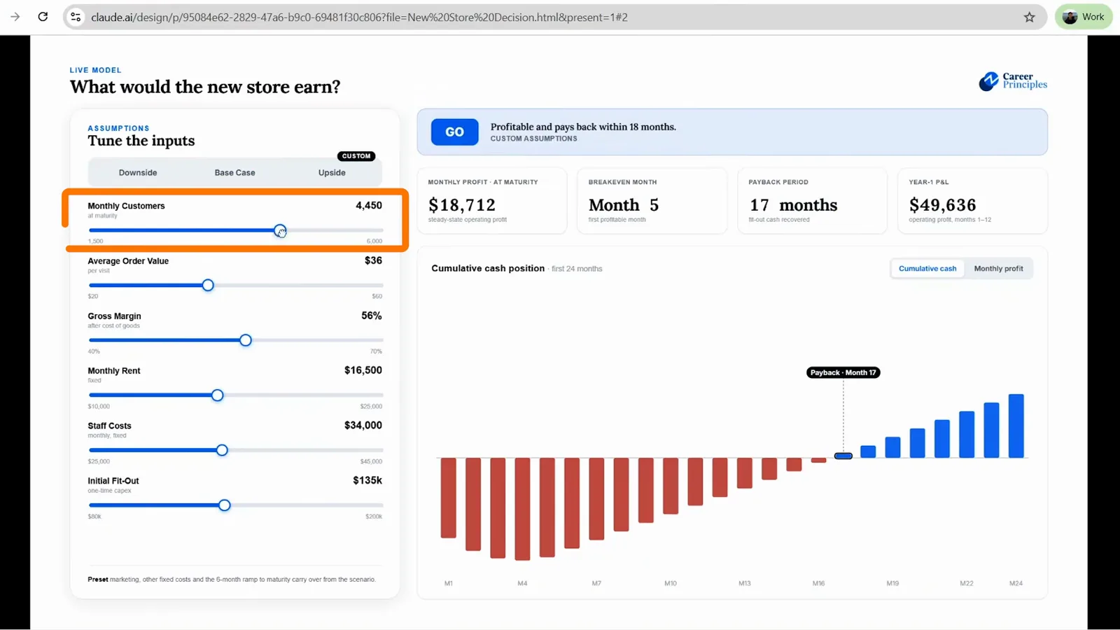
The red-to-blue crossover is more persuasive than any paragraph of prose.Watch at 7:29 - 8
At target traffic the page settles on GO
With monthly customers at 4,000 the page reads $20,728 at month 5, payback in 16 months and $68,897 of cumulative cash, badge steady on GO. Prepare two or three dial settings before the meeting and you can answer "what if footfall halves?" live instead of promising a follow-up.
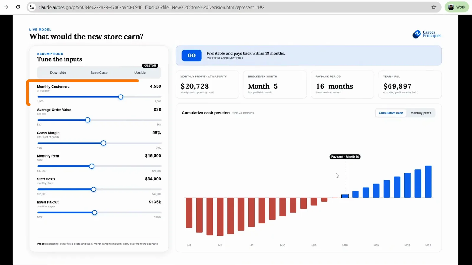
Every assumption level gets its own screen; questions get answered in the room.Watch at 7:30
Template 3: the self-serve metrics dashboard
- 9
Dashboard top band: eight KPIs pinned to one row
The third structure is a reusable dashboard. The prompt line that matters is Kenji's "create a reusable dashboard where I can upload a new CSV file with a button". The top band then fixes the eight numbers: $562,898 revenue, $264,081 spend, 12,043 clicks, 2,298 conversions, 1.0% conversion rate, $22 cost per lead, $115 cost per conversion, 2.13x ROAS. Swap the data and the definitions stay put.
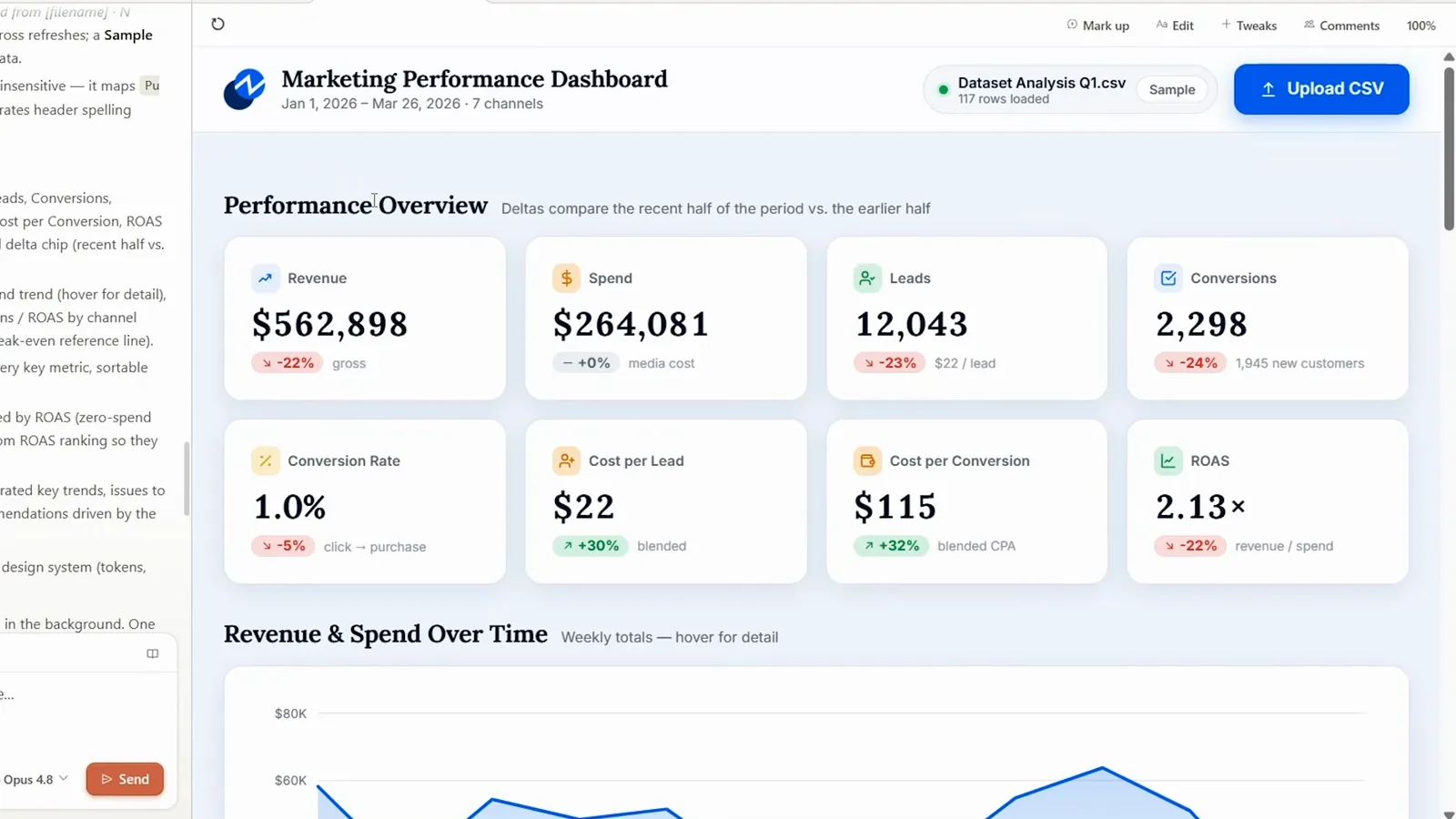
Pin the metric definitions once; every future dataset pours into the same row.Watch at 9:37 - 10
Revenue and spend share one canvas - the gap tells the story
Below the KPIs, the Revenue & Spend Over Time chart plots both lines together, so the widening gap is profit and the narrowing one is trouble. Because the design system is attached, the palette follows the brand without a single colour instruction in the prompt.
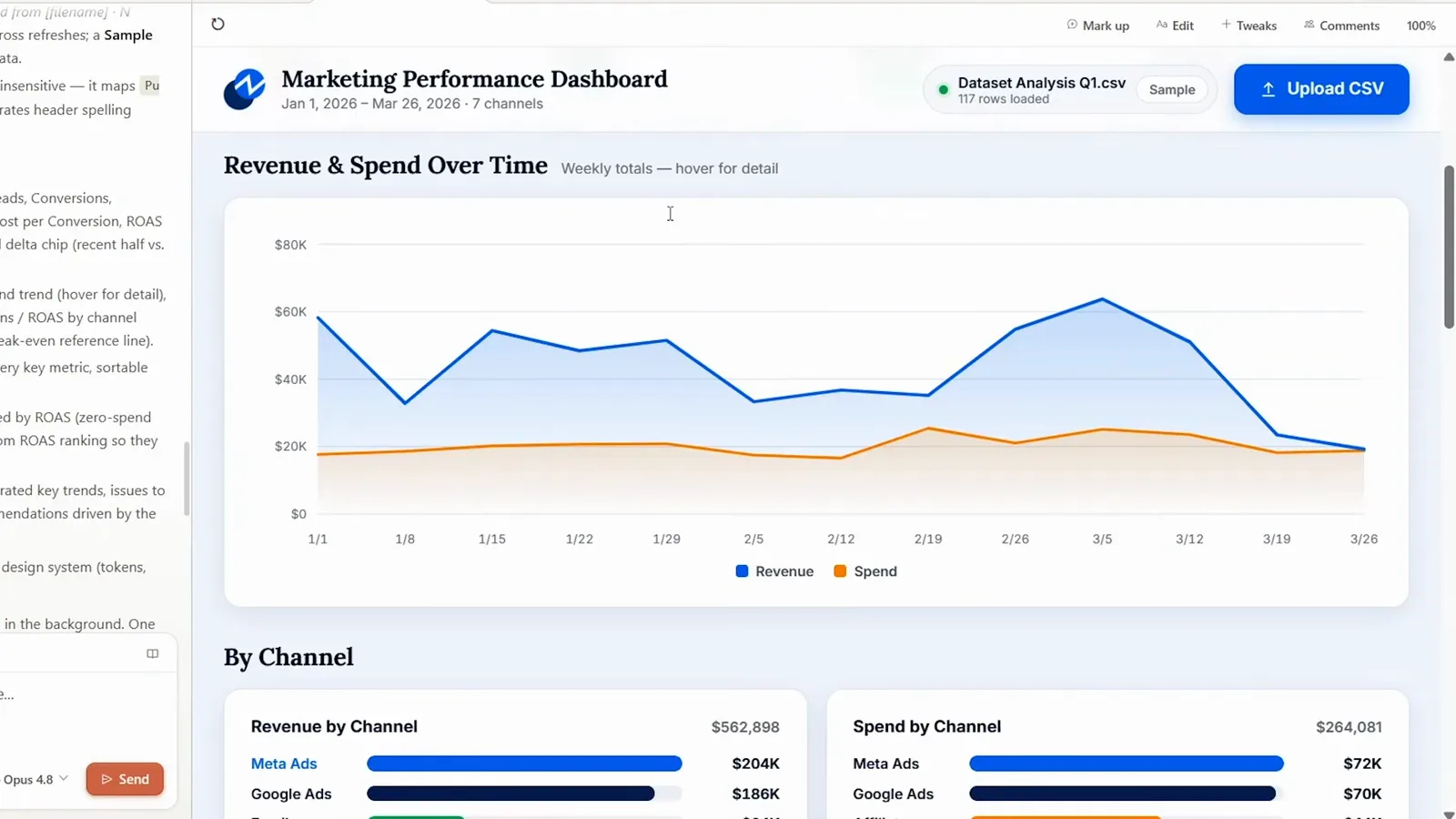
Two lines, one canvas - the gap between them needs no annotation.Watch at 9:39 - 11
Hover any point and read the exact number
Every point on the chart is hoverable: January reads $48,424 revenue against $30,808 spend in a small tooltip. When someone asks "how bad was January?" in the meeting, the answer is one hover away - no tab-switching to the spreadsheet.
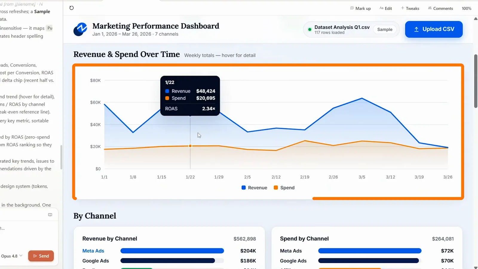
Hoverable values keep the chart honest under questioning.Watch at 9:42 - 12
By Channel: four bar groups rank every channel
The By Channel section ranks Meta Ads, Google Ads, Affiliates, LinkedIn, Organic, YouTube, Email and TikTok across four bar groups - revenue, spend, conversions and ROAS. One glance shows Meta leading revenue while Google Ads leads conversions. Rename the channels and the skeleton survives any mix.
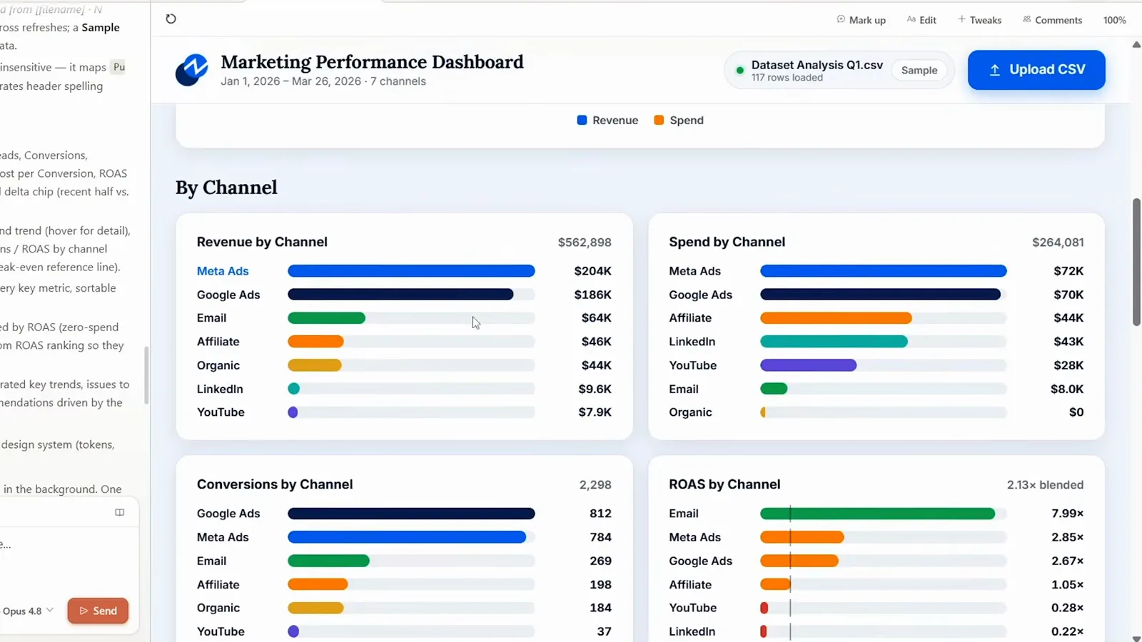
Four ranked bar groups and the channel debate ends itself.Watch at 9:44
Close the dashboard with a verdict page
- 13
Standouts name the best and worst; the table shows the receipts
A Standouts pair calls out Email as worst performer and LinkedIn as best, then a Channel Performance Detail table keeps the exact per-channel rows underneath. Verdict first, receipts below: refresh the CSV next quarter and this page holds its shape.
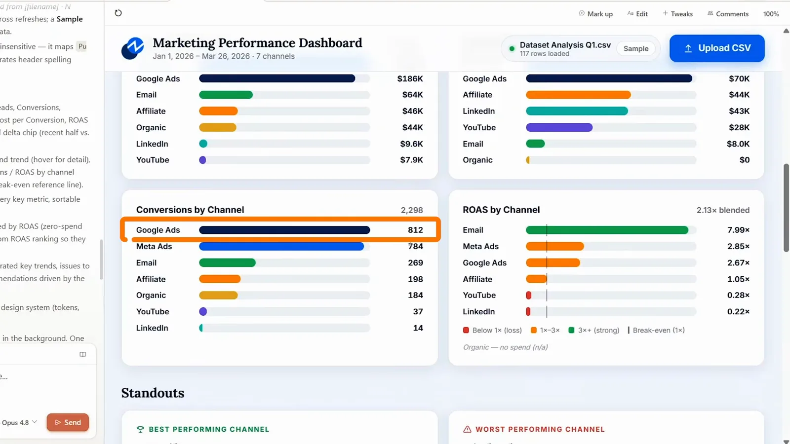
A named verdict backed by a detail table is what makes the dashboard repeatable.Watch at 9:54 - 14
Open the verdict with a Quarter at a glance
The conclusions area opens with a dark Quarter-at-a-glance card written like a manager's summary - revenue up in Q2 2026, spend growing faster, cash conversion under pressure - with the quarter window and figures it draws from noted underneath. The slot is fixed: one paragraph, sourced numbers, no bullet points.
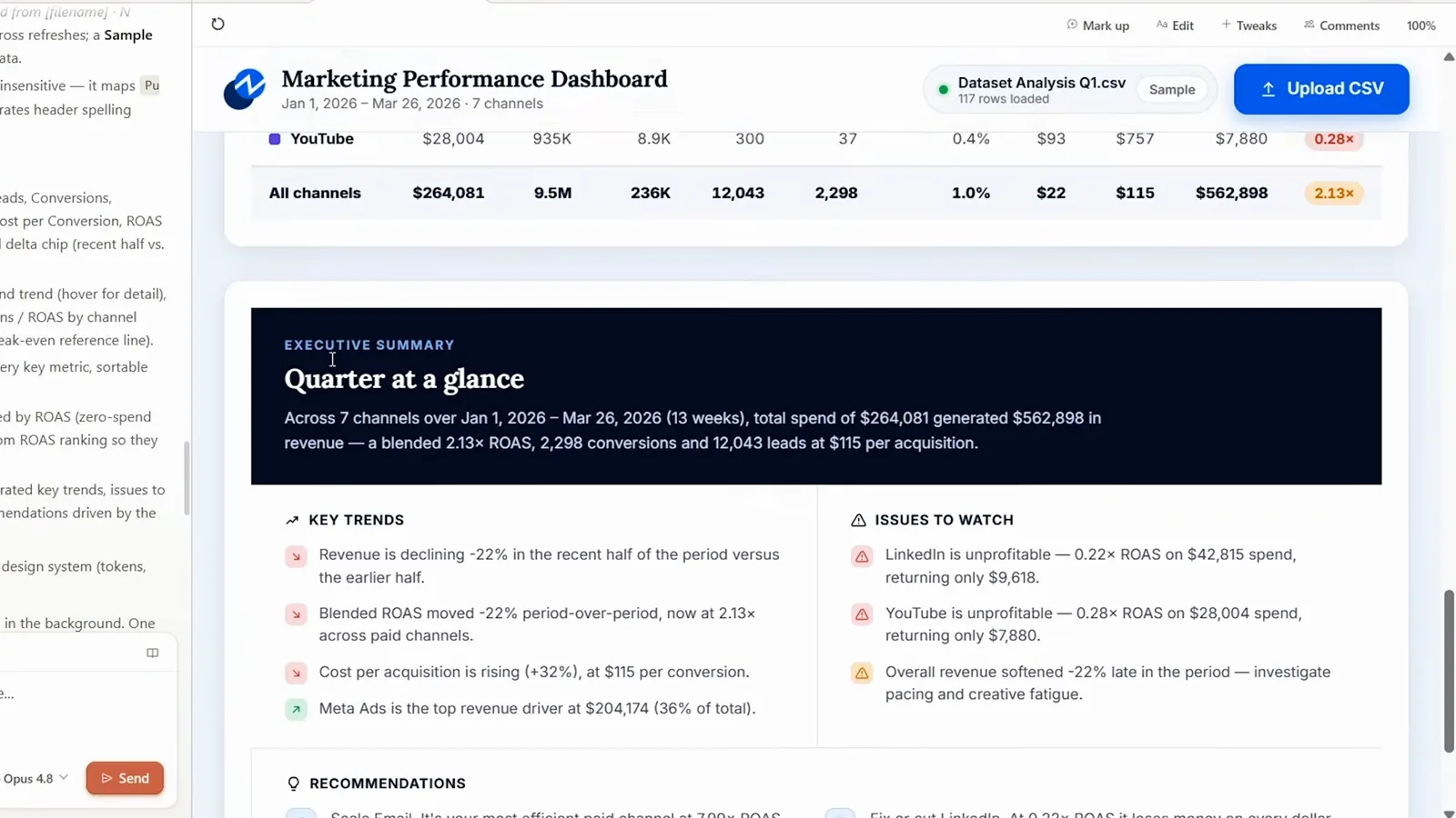
One paragraph of plain language before any list appears.Watch at 10:02 - 15
Key wins, watch-outs, recommendations - then refresh and repeat
The final section splits into Key Wins, Watch-outs and Recommendations lists. Kenji's Q1 file loads 117 rows; uploading the Q2 CSV rewrites every number on the page. That refresh is the real test of a template: if it only worked for the data it was born with, it was a deck, not a template.
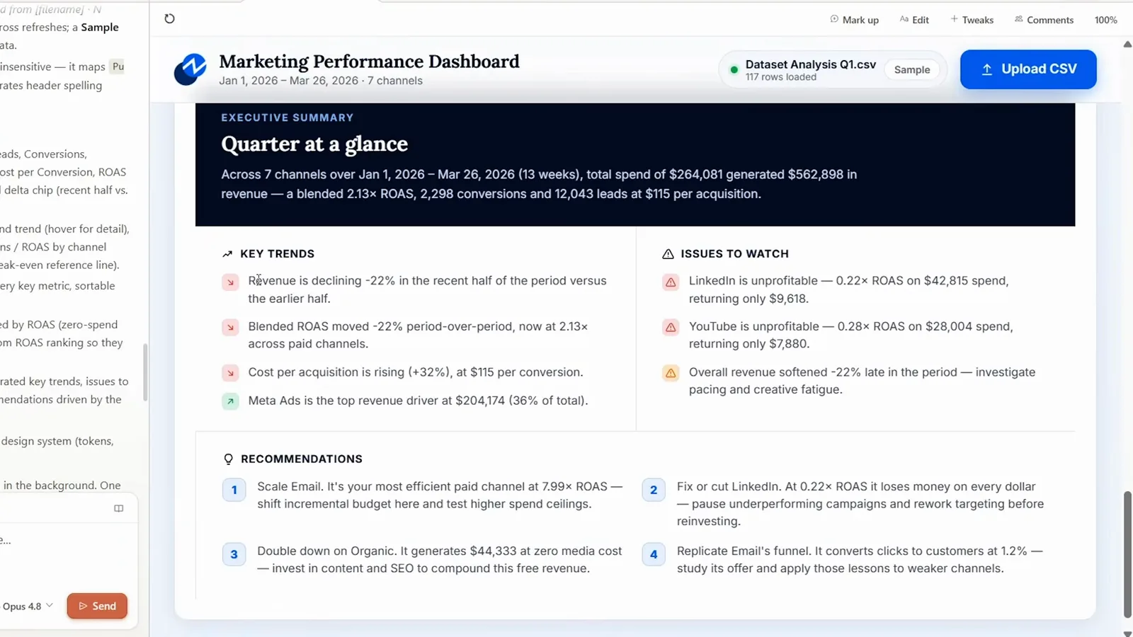
Upload a new CSV and the page rewrites itself - that is what makes it a template.Watch at 10:04